Seven Compelling Charts from Our Spring Issue
- By
- March 29, 2017
- CBR - Accounting
In charts, the most visually prominent data point is not always the most important. Even when it is, additional details that researchers want to highlight can be lost in the shadows. As we created our Spring 2017 issue, we found ourselves working to draw out those details again and again, hoping to highlight these crucial but easily overlooked data without bogging down our charts with unnecessary density. Here are a few examples of how we did it.
Ancestry can pave the way for foreign investment
 Click the map to view it in high resolution
Using 130 years of data on migrations to the United States, a team of researchers including Chicago Booth’s Tarek Alexander Hassan explores how new arrivals to the US bring with them the potential for future investment from their home countries.
Our friends at Calibro studio turned the data into a stylized global map. They sized each country according to the likelihood that a wave of migrants to the US would attract investment, then applied a color scale to show the proliferation of the country’s investment connections in the US.
In the details: A two-part color scale allows us to display a broad range of data in a useful way. About two-thirds of the countries fall in the 1–100 range on the scale, represented in shades of blue, while the rest quickly climb above 800, represented in shades of violet.
A group of researchers including Chicago Booth’s Eric Zwick assess the effectiveness of the Internal Revenue Service’s First-Time Homebuyer Credit (2008–10). The data, a sample of the US population sorted by the number of potential first-time home buyers, provide the opportunity to use color to show a timeline of activity during and after the 2007–10 financial crisis that suggests the program did work.
In the details: We show patterns through 2011 because the researchers emphasize that while home sales dipped after the program ended, they did not stagnate, as some had feared.
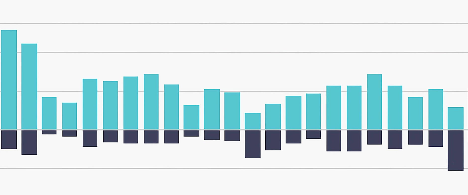
Assessing Twitter data from last year’s rollout and recall of the Samsung Galaxy Note 7, which was plagued by explosions, Chicago Booth’s Pradeep K. Chintagunta finds that while the phone itself took a beating in terms of sentiment, the main Samsung brand was not too badly affected.
Separated into tallies of positive, negative, and neutral tweets, the data provide a timeline of public sentiment. For simplicity’s sake, we intentionally leave out the percentages of neutral tweets. Though the Samsung chart may appear mundane, since it shows little fluctuation through the time period, the juxtaposition proved intriguing from a brand-management perspective.
In the details: The data offer the opportunity to create a chart using a reverse scale. While the bars representing positive sentiment stretch upward, the ones representing negative sentiment go downward. Typically, charts with bars going downward indicate actual negative numbers, but in this case, the intention is to visually show the balance of the two data sets using the same 0 percent baseline.
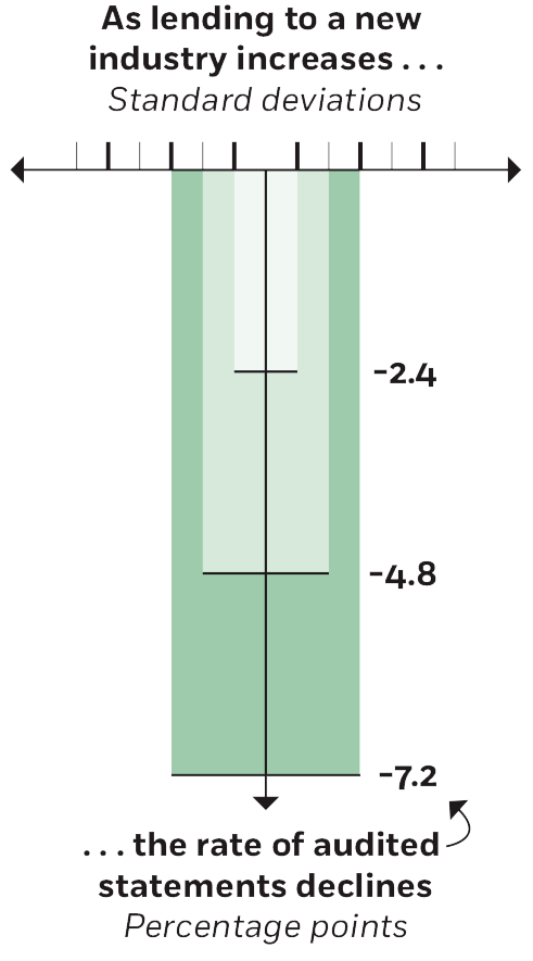
Studying how well banks develop lending expertise, a team of researchers including Chicago Booth’s Philip G. Berger finds that for every 1-standard-deviation increase in a bank’s exposure to an industry, it sees a 2.4-percentage-point decline in audited statements from borrowers.
In the details: That finding provides a chance to visualize standard deviations—a commonly understood concept in the realm of academic research but a bit of an abstraction for many on the outside. The data here establish a visually approachable correlation.
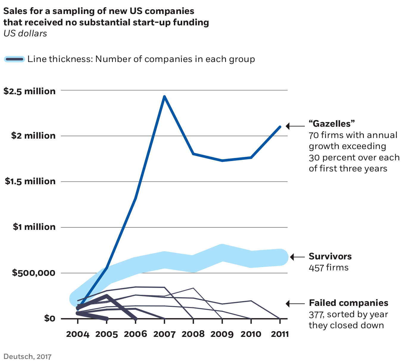
Breaking down the sales growth of US start-ups over time, Chicago Booth’s Waverly Deutsch categorizes successes and failures in helpful ways, making for interesting, if straightforward, line charts.
In the details: The extra layer of data allowing us to assign a proportional thickness to every line visualizes an interesting aspect of Deutsch’s piece: while much attention is paid to the few companies that see wildly exponential growth, the sales trajectory is comparatively quite modest among the vast majority of firms that learn how to survive.
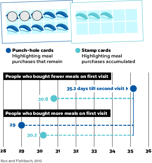
A team of researchers including Chicago Booth’s Ayelet Fishbach used a restaurant loyalty promotion (buy 10 meals, get one free) to study people’s motivation to achieve a goal. The data focus on how soon customers came back for a second visit.
In the details: Since the largest numbers often draw the most attention, we used this dotted-line approach, emphasizing each data point’s difference from the largest number.
Studying consumer sentiment around the time of a German tax hike that was announced more than a year before it was enacted, a team of researchers including Chicago Booth’s Michael Weber tracked people’s willingness to make big purchases. The data show a predictable spike—people were inclined to spend in the months before the tax went into effect.
In the details: Another key finding highlighted in the chart is seen in the months following the tax going into effect. People’s willingness to spend remained comparable to their willingness before the hike was announced—rather than plunging once the tax was in place.
Your Privacy
We want to demonstrate our commitment to your privacy. Please review Chicago Booth's privacy notice, which provides information explaining how and why we collect particular information when you visit our website.